Work Wrapped in Color: How Paint Affects the Workplace
We've painted a lot of commercial spaces in and around Houston. Medical offices in Clear Lake, warehouses in Pearland, retail buildouts in the Energy Corridor, small professional offices all over League City and Friendswood. And what I've noticed is that almost nobody thinks much about color until they're already committed to a bad one. Most commercial painting decisions happen in a vacuum — someone picks something off a card, paints the whole office, and then lives with it for five years wondering why the space feels wrong.
Color in a workplace is not a design-magazine conversation. It's practical. Here's what we've actually seen.
What Colors Do in Different Types of Spaces
Blues and blue-greens — think soft teal, slate blue, muted navy — consistently show up in spaces where people are doing focused, desk-based work. There's real research behind this going back decades: cooler tones reduce mental fatigue in sustained focus environments. It's not magic, it's just that warm colors trigger alertness and cool colors lower it slightly. In an open office where people are concentrating for long stretches, that matters.
Medical offices are interesting. Most of them go with very light, neutral warm whites or off-whites. That's not just an aesthetic choice — it makes the space feel clean and clinical to patients, which is what patients expect. We've painted a few pediatric offices where the client wanted to add some color. That usually works in the waiting area and kids' zones, where you want a warmer, more welcoming feeling. But even there, the exam rooms stay neutral. Too much color in a medical exam room makes patients uncomfortable in ways they can't always articulate.
Warehouses almost universally stay white or off-white on the walls. Lighting and cleanliness are the priority. But accent colors on columns, equipment zones, and safety markings actually do help with navigation and reduce errors. That's a different kind of color decision than picking a wall paint, but it's still a painting job.
Retail is where warm tones come in. Earthy oranges, warm yellows, muted reds — these are used in customer-facing environments because they create a sense of energy and trigger engagement. You don't want them in a back office where people work all day, but in a showroom or a restaurant, they work.
Why Most Offices End Up Beige-Gray — and Why That's Not Entirely Wrong
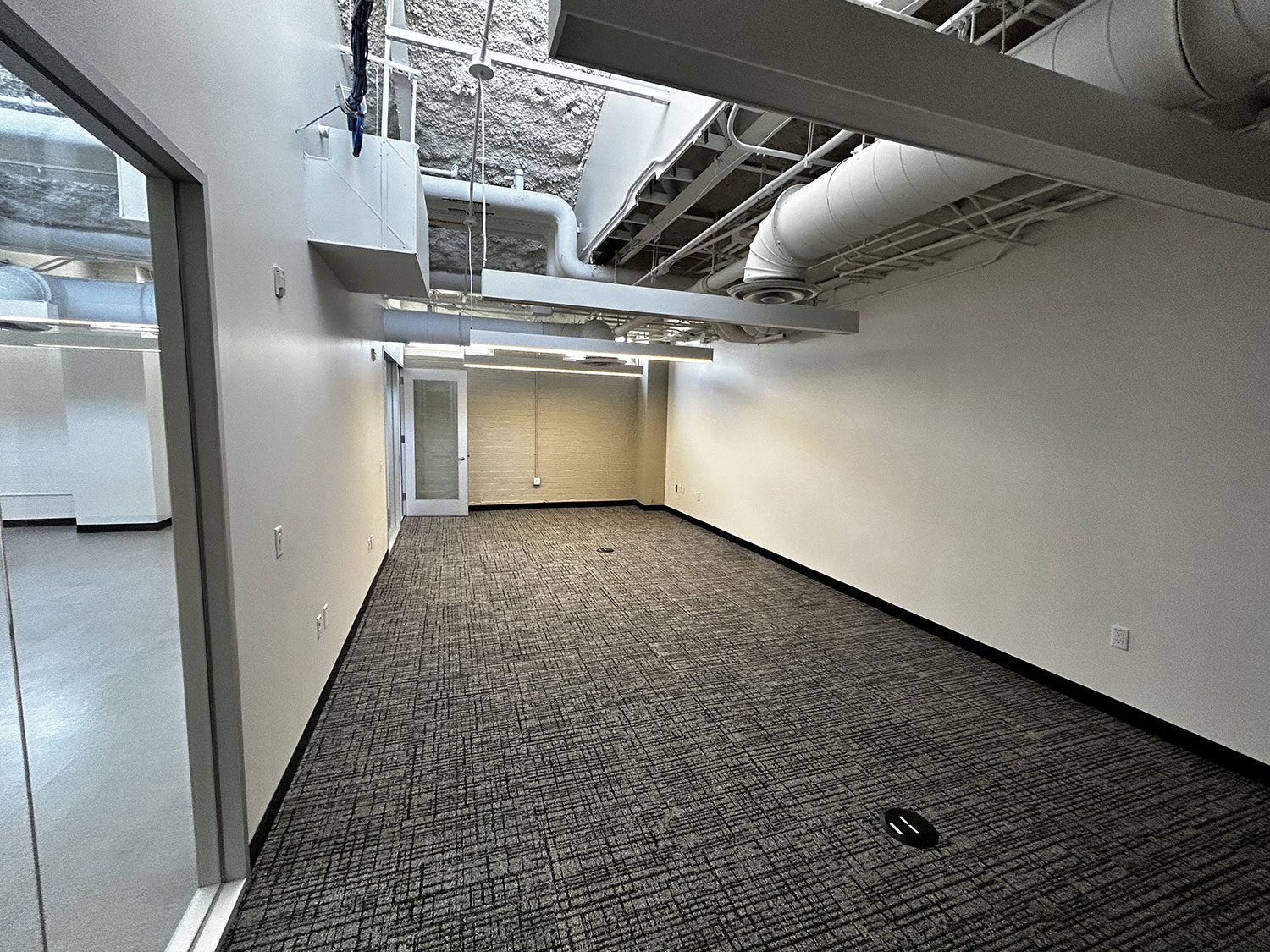
The most common color on commercial walls in the Houston area is some version of greige — a gray-beige that sits in the middle of everything and offends nobody. I'd estimate 60% of the office spaces we paint end up in this territory. People don't ask for it because it's inspiring. They ask for it because no one will complain about it.
And honestly, for a lot of office environments, neutral is the right answer. When you have a diverse team working in a space for years, a color that no one dislikes is often better than a color some people love and others find grating. Color is personal. A bold choice in a shared workspace generates opinions.
The mistake isn't picking a neutral. The mistake is defaulting to it without thinking. A warm white in a small office with south-facing windows looks completely different than the same color in a large, north-facing conference room. Those decisions should be made by actually looking at paint in the real space, under real lighting conditions, not from a chip card in a store.
The Biggest Mistake Commercial Clients Make
They pick the color before seeing it on the wall. Every time. They come to us with a color chip or a photo from someone else's office and say they want that. We mix it, they approve it, we paint a room. Then they walk in and the color is completely wrong — too dark because the room has no windows, too cold because the flooring is pulling it one direction, too something. And now we have to paint it again.
The fix is simple: paint one wall, or a large section of one wall, with the real paint. Look at it during the day and in the evening. Bring in a few people from the team. Then decide. The cost of a test patch is nothing compared to the cost of repainting 5,000 square feet.
Ready to Get a Quote?
We serve League City, Houston, Friendswood, Pearland, Kemah, and the surrounding area. Call or book online.