Colors are the reflection of people expressed in the spaces; they can change the mood and make us feel more or less comfortable.
Colors influence people, give us feelings, stimulates our senses, and create unconscious associations in the human brain daily. Color is essential to define the function of a space.
Color cannot be a distraction in work environments. It is crucial to use soft and light colors that humanize the space; if you aim for a peaceful environment, warm, and pastel tones are the best alternative. Neutral colors, such as gray and black, are usually used in offices as well.

Color contrasts are the key to reducing monotony in workspaces and should change depending on the activities in different spaces. Balanced use of colors, materials, and textures provide the proper stimulus to promote creative and productive at work.
Warm colors in office spaces create light and energy in environments, generate brain activity, connect us with communication and inspiration. Yellow, for example, is the color of optimism; it communicates joy and transmits power; it also promotes the exchange of information. Meeting rooms and shared spaces are optimal for it; however, pick a tone on the softer side, since an intense one can cause fatigue.
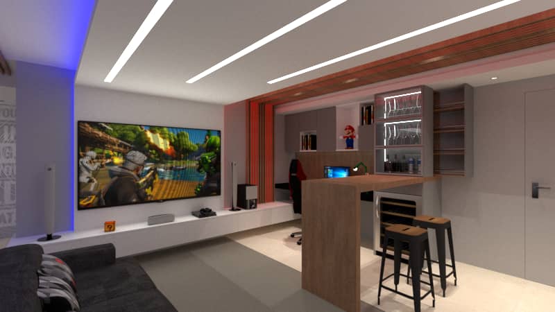
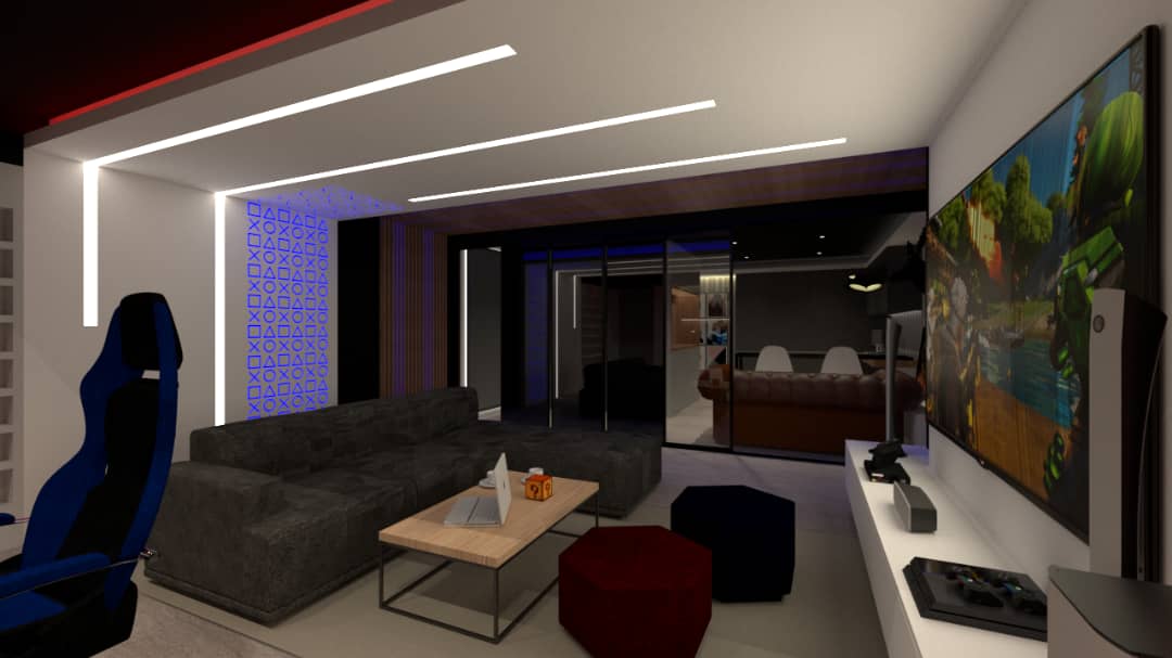
Orange is related to red, but it is not as shocking, it evokes emotion and enthusiasm. It is a warm and intimate color that gives us informal interaction with others, and it also stimulates the appetite. You would like to incorporate orange tones in welcome areas, casual meeting rooms, game rooms, exercise rooms, social work areas, and cafeterias.
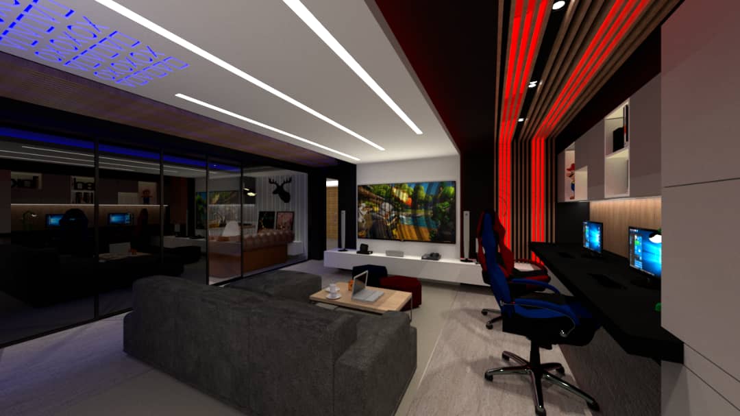
Red has a substantial impact on people, and it increases the energy level at work. It symbolizes power, excitement, passion, it provides strength and stamina, and also stimulates conversation and brings people together. Red should be avoided in elements that separate individual workspaces.
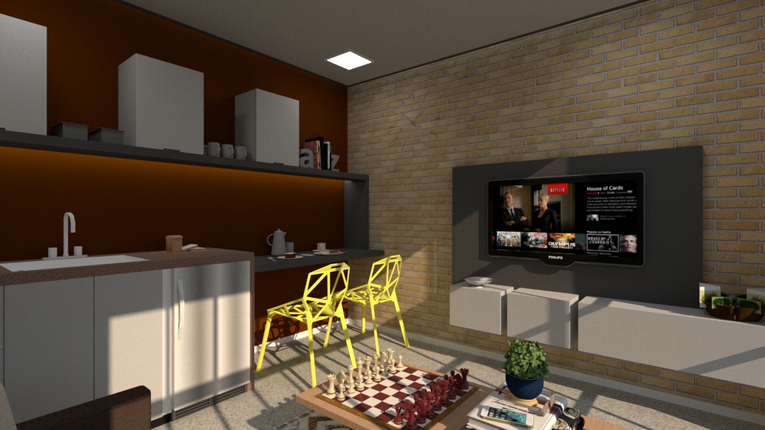
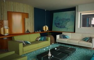
Cold colors, like brown, evoke earth, tradition, and safety. Materials of this color represent nature. They should be used in informal or calm settings where social life usually develops.
Another color that relates to nature is green, a symbol of freshness, growth, and hope. It usually opens people’s minds, promotes concentration, and has relaxing, balancing effects. It is ideal for individual workspaces or training rooms where a large amount of information needs to be assimilated. Green is also the color of hope: it represents the anticipation of things to come.
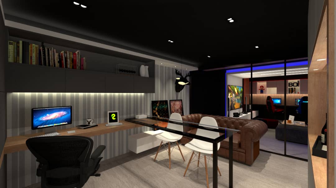
Blue is peace, patience, stability, fidelity, trust, and rationality. It has been proven that blue lowers blood pressure and pulsations. It is a perfect shade for minimalist decoration in which furniture with straight lines and few objects are used to accentuate the style. It is primarily used for workspaces with a high level of stress, such as call centers, or spaces where difficult negotiations occur.
Let’s not leave behind white, which is a great ally to create spaciousness in the workspace, transmit positivity, and represent purity and cleanliness. When combined with relaxing colors (green, blue, pastel colors), it can achieve tranquility and harmony.
To summarize, colors are not in things, they are in the light, seeing an object red, orange, yellow, green, blue, violet or some combination of these is a matter of reflection and absorption. Colors in interior design are also capable of modifying light perception and influencing people’s moods.
Architect Rafael Rangel