A New Decade That Dresses in Color
2020 was a strange year to be in the painting business. It was also, unexpectedly, one of our busiest years for interior work. People who had lived in their homes for years and never cared about the wall color suddenly cared deeply. They were home. All day. Every day. Staring at the same beige walls they'd always ignored. And they wanted to change them.
We painted a lot of bedrooms, living rooms, and home offices in 2020. And the color choices were different from what we'd seen in years prior.
What People Were Actually Choosing in 2020
The all-gray era was ending. For most of the 2010s, gray was the default residential wall color in the Houston area. Agreeable Gray, Repose Gray, Mindful Gray — those Sherwin-Williams neutrals went on probably 40% of the walls we painted between 2015 and 2019. Gray reads as modern, clean, and safe. It photographs well. It works with almost any flooring.
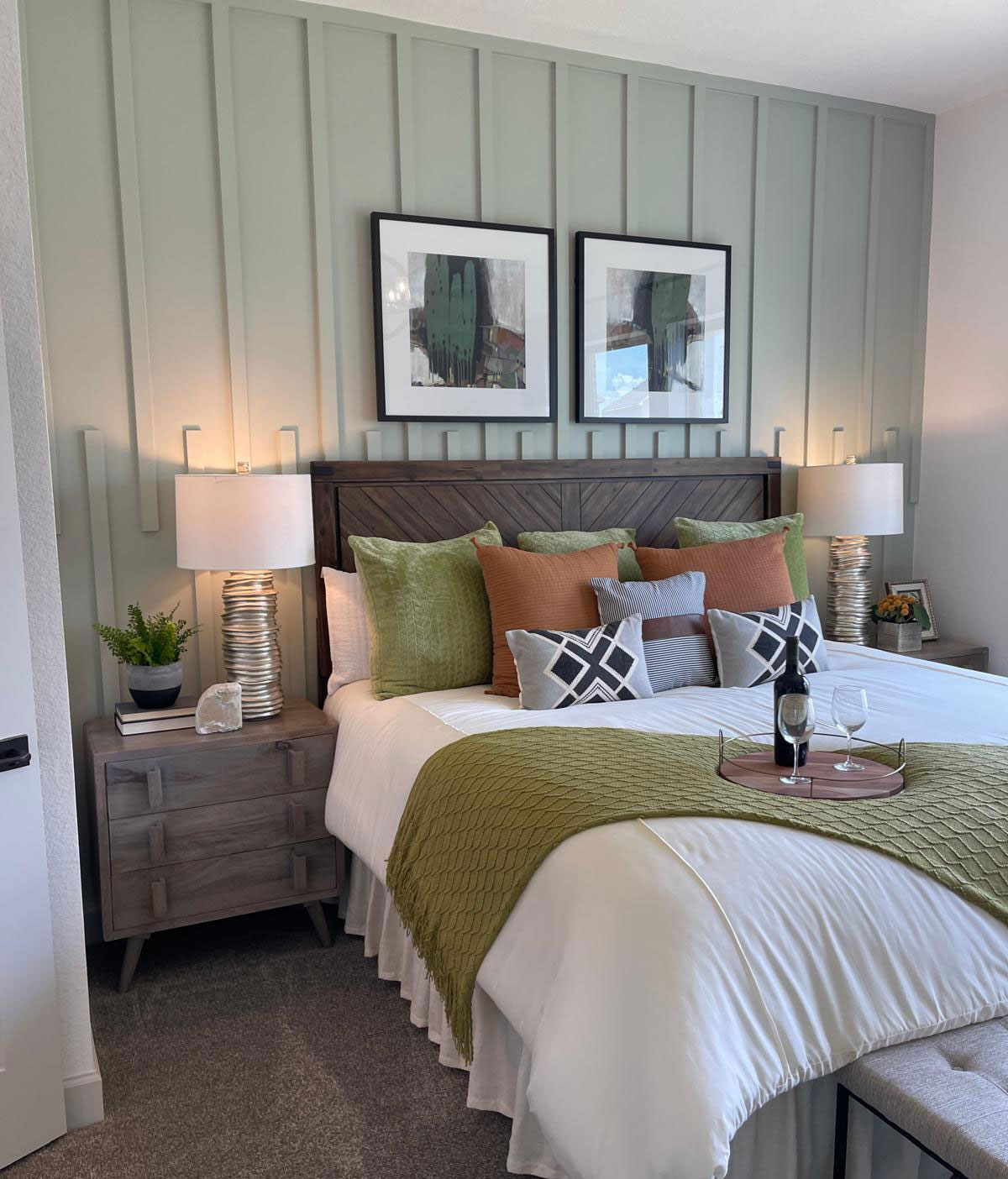
But by 2020, people were tired of gray. What replaced it was earthy and warmer — muted terracotta tones, warm whites with a yellow or cream undertone instead of a blue one, dusty sage greens, and soft dusty blues that read almost as a neutral but with more life than gray. Sherwin-Williams Accessible Beige made a comeback. Benjamin Moore's Muslin and White Dove started showing up a lot. We were mixing a lot more greens that year than we had in years — not bright greens, but quiet mossy or sage tones that work in bedrooms and living rooms.
The move away from cool gray and toward warm earth and organic tones wasn't random. People spending all day inside wanted their walls to feel warmer and more human. Gray is great for a show-home that nobody lives in. Warm greens and earthy tones feel like you're actually inhabiting a space.
The Home Office Wall Problem
This one I did not see coming. Starting in spring 2020, we started getting calls specifically about painting one room — the home office or the spare bedroom being converted into one. The reason was Zoom. Video calls made people look at their backgrounds. And suddenly a wall that had been fine as an afterthought became the thing 50 other people were staring at during every work call.
We painted a lot of home offices that year in colors clients described as "professional but not boring." That usually meant a medium-depth navy or slate blue, a warm white, or a muted green. One client in League City had us paint an accent wall behind her desk in a deep hunter green — she said it looked better on camera than the beige she'd had before. She was right.
The interesting thing about the Zoom-wall phenomenon is that it got people thinking about color in a way they never had before. Once they changed the home office wall, they started looking at the rest of the house differently. A lot of 2020 interior jobs that started as single-room projects turned into whole-house repaints by the time we were done.
How Color Trends Actually Work — and Why They Hit League City Late
Color trends don't move fast. They move through layers. A color shows up in high-end design publications around year one. Interior designers start using it in luxury projects in year two or three. It hits HGTV in year four. Home Depot starts stocking the color chip in year five. And by year six or seven, it's showing up on walls in League City subdivisions like Calder Woods and South Shore Harbour.
What Instagram made look like an instant trend was often a color that had been bubbling for 2 to 3 years in design circles before regular homeowners found it. The dusty sage greens that seemed everywhere on social media in 2019 started hitting our residential client requests in 2020 and 2021. The warm terracotta tones that were all over design blogs in 2018 showed up on walls out here around 2020-2022.
This lag is useful if you want to stay ahead of it. If you're planning a repaint now and you want colors that feel fresh but won't look dated in two years, look at what high-end design projects in New York and LA were doing two or three years ago. That's what's coming to the suburbs next. Right now that probably means deep forest greens, warm cream whites, and clay-toned browns — colors that have been in design-forward spaces for a couple of years and are just starting to land on residential walls in neighborhoods like ours.
Ready to Get a Quote?
We serve League City, Houston, Friendswood, Pearland, Kemah, and the surrounding area. Call or book online.